Walmart Conversion Drivers
UX Design, UI Design, Visual Design, Copywriting
Conversion drivers are signals on a webpage that increase the sales of a product. This can be done through urgency notifications, on page signals, and trust signals. In this project, I designed a trust signal conversion driver message for the product description page of the items in five categories: TV’s, Laptops, Tablets, Headphones, and Tires.
Problem Statement:
How might we build trust for items that don’t have many reviews?
Solution Statement:
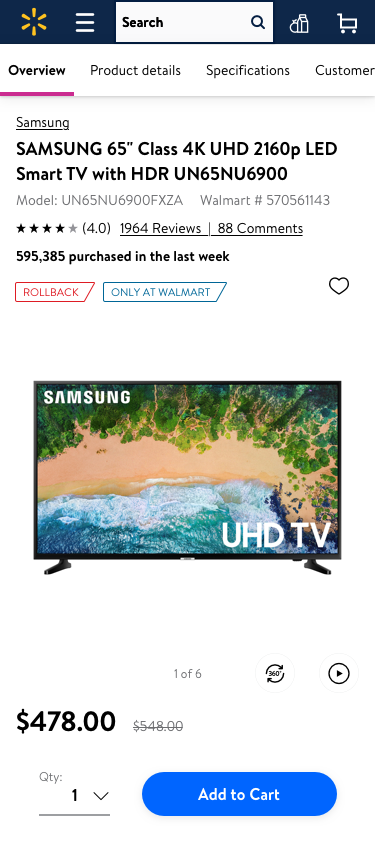
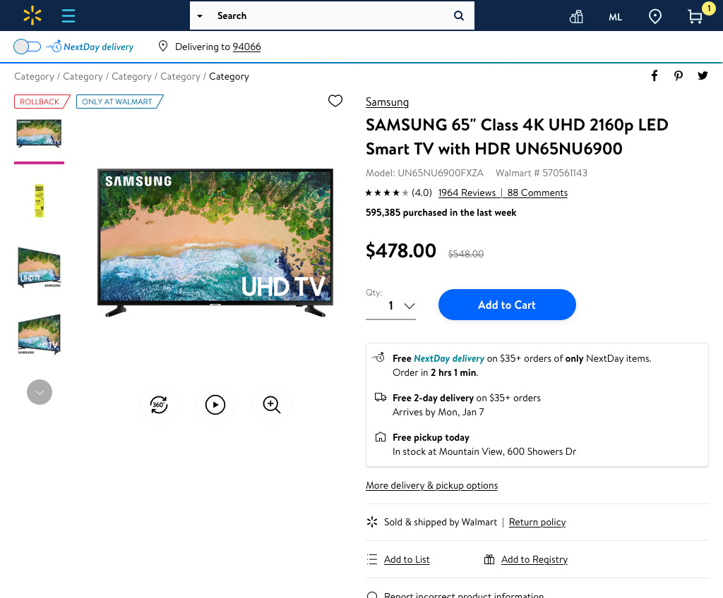
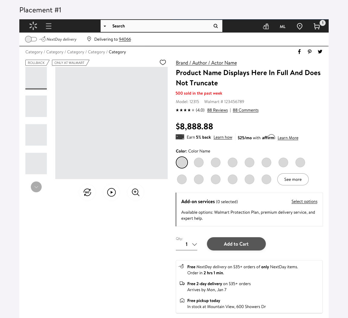
Add a message to the Product Description Page that tells the customer how many units are sold per week.
Project Process
Competitive Analysis
Copy
Placement
Styling
Final Design
Competitive Analysis
I started this project by looking at other websites to see how they treat conversion drivers on their pages. Most of the examples I found were from E-Commerce sites as well as hotel booking sites.

Copy
In order to come up with the best way to phrase this conversion driver, I worked with a content strategist discuss ways to write the message such that it helps the customer trust the product.
500 sold in the last week
Cons: "Sold" is very Walmart centric. A more customer centric term may be more compelling.
500 purchased in the past week
Pros: "Purchased" is more customer centric
500 purchased this week
Pros: "Purchased" is more customer centric, concise.
Cons: The numbers won't be very impressive early in the week.
500 customers purchased in the past week
Pros: "customers purchased" is very customer centric.
Cons: Too wordy
500 purchased last week
Pros: Concise
Cons: Values only update once a week instead of everyday
Purchased 500 times in the last week
Pros: Concise
Cons: Harder to skim when the number doesn't come first
Placement
I looked at all the different places on the screen that this conversion driver could live while keeping the styling consistent in order to choose the placement that fits in with the rest of the page.
PROS: High on the screen and right below the product title (more likely to be seen). CONS: Pushes down important information (product # and ratings), no logical connection to its surroundings.

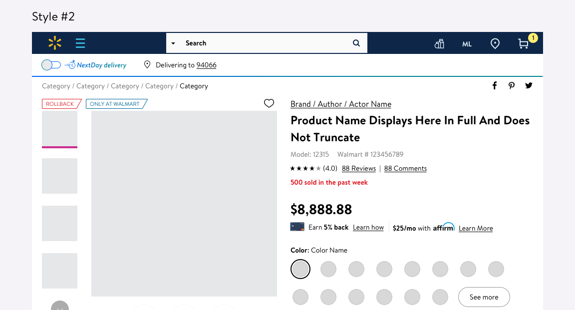
PROS: High on the screen (more likely to be seen), right above ratings (also builds trust). CONS: Visually looks out of place, pushes down important information (ratings).

PROS: High on the screen (more likely to be seen), right below ratings (also builds trust).

PROS: Lives in the same place as the "Only # left" message, high on the screen (more likely to be seen). CONS: No logical connection to its surroundings.

PROS: Right above "Add to cart" button (may help increase Add to carts). CONS: Lower on the screen than the other options, this is very valuable real estate on the page.

PROS: Right below ATC button (may help increase ATCs). CONS: Lower on the screen than other options, This is very valuable real estate, may conflict with other ongoing projects.
Styling
After deciding on a placement, I designed the message in several different styles, including different colors, icons, and sizes.

PROS: Fits in stylistically, not too busy. The placement already draws enough attention. CONS: Doesn't stand out as much as other options.
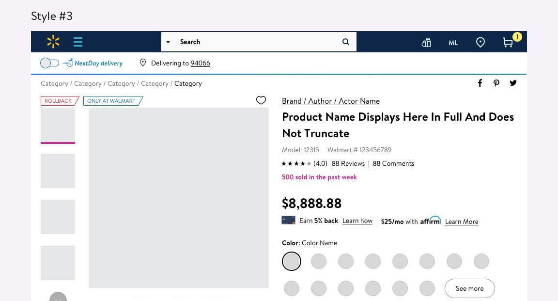
PROS: The red draws a lot of attention. CONS: Red might convey the wrong message (too urgent, almost yelling at the customer), and we want to avoid adding too much color to the Product Description Page.
PROS: The pink draws a lot of attention. CONS: Pink is used for specific purposes in Walmart's design, and we want to avoid adding too much color to the Product Description Page.

PROS: The icon helps to draw attention. CONS: The thunderbolt is not entirely relevant to the message, and it would take more time to create and build a new icon that is more relevant.

PROS: The icon helps to draw attention. CONS: This icon is already used to represent recent searches, so it could be confusing for the customer, and it would take more time to create and build a new icon that is more relevant.

PROS: The colored background draws attention and is already part of the design library. CONS: We want to avoid adding too much color to the Product Description Page.