
Walmart Search Audit
UX Design, UI Design
During my 10 week internship at Walmart, I worked on a site audit project where I documented the interactions and features of typeahead portion of search on the Walmart app. Through this documentation, I identified pain points and gave suggestions based on these pain points. Finally, I compared my suggestions by building mock ups and identifying their pros and cons to determine which designs to move forward with.
Challenge:
Combine Walmart’s Grocery and General Merchandising apps into one app.
Experience Goals:
Increase consistency of the search experience for the customer between the two hallways, and reduce customer pain points.
Project Process
Audit and documentation
Identify pain points and give suggestions
Compare suggestions and identify pros and cons to determine recommended next steps
Audit and documentation
High level wireframing
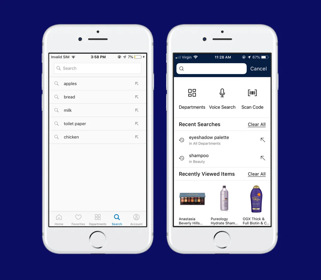
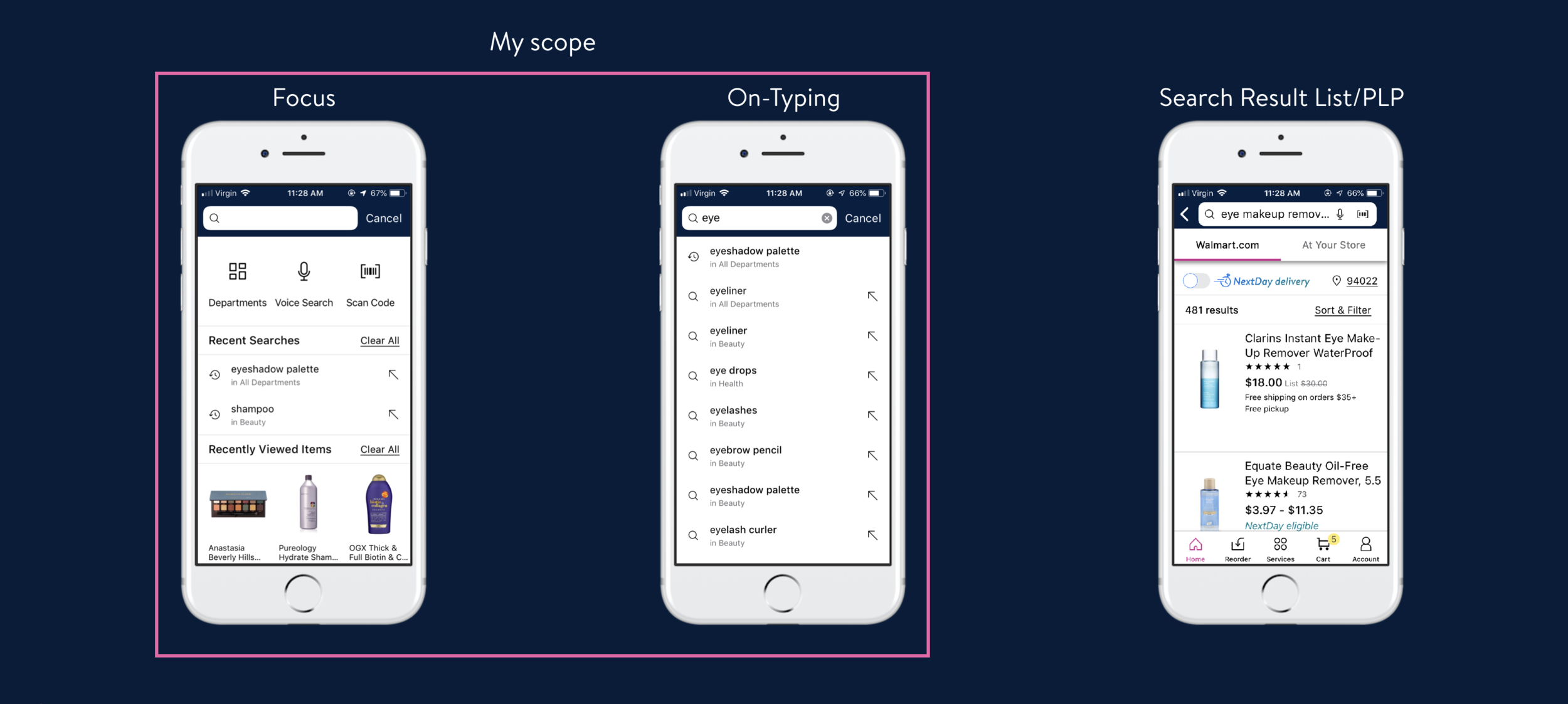
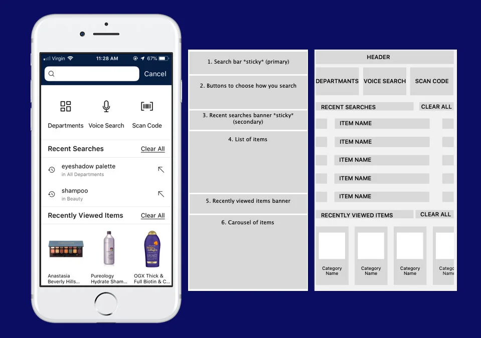
Focus
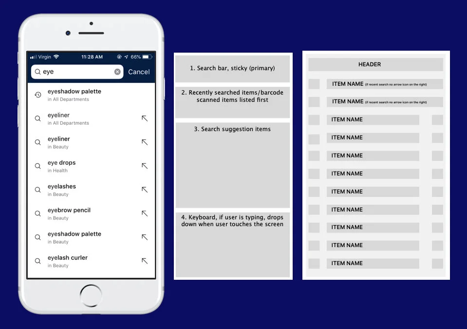
On-Typing
Document all use cases and error cases
Identify pain points and make suggestions
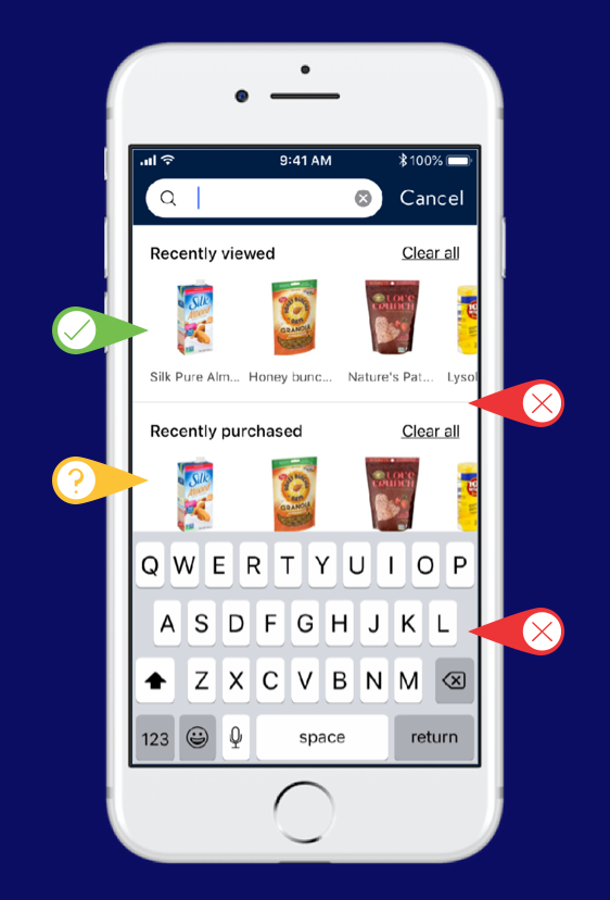
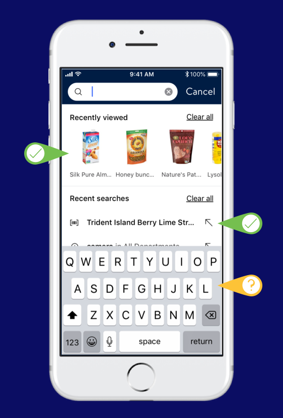
Summary of pain points
Focus
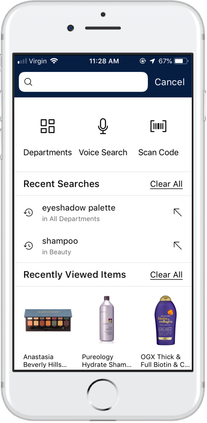
Shop by department/voice search/scan a barcode buttons are rarely interacted with by users
Recent searches are interacted with less than recently viewed items
Recently viewed items are not visible under keyboard
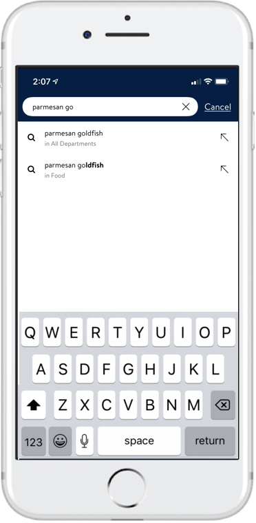
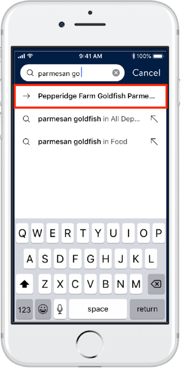
On-typing
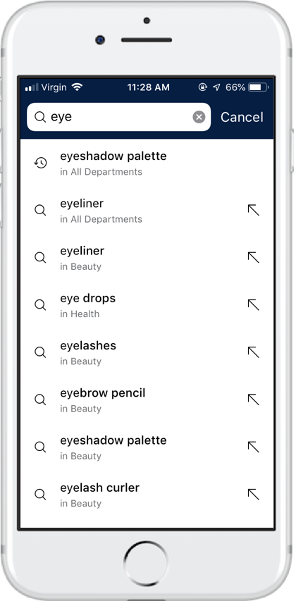
Redundant search suggestions
Several suggestions lead to the same PLP
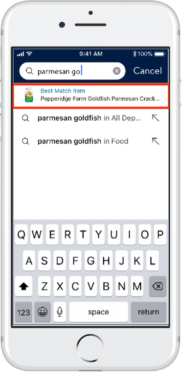
No item suggestions on typeahead (except scanned items)
Search suggestions only lead to PLP
“I DON’T want to view EVERYTHING that you sell. I ONLY want the ONE item that I asked for” (VoC feedback)
Inconsistent use of icons
Use of arrow icon is inconsistent
Relevancy of search suggestions
Scanned items are suggested despite them not matching the letters in the search query
Design Recommendations
Redesign suggestions - Focus
Old design
Redesign idea #1
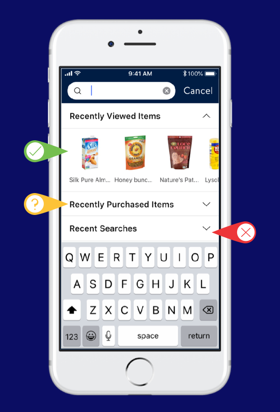
Pros:
Recently Viewed items are visible
Cons:
Recent Searches are not visible and you have to tap to view them, but the user is aware that it is there
Unsure:
Recently purchased items can be viewed if the user taps on the drop down menu
Redesign idea #2
Pros:
Recently Viewed items are visible
Cons:
Recent Searches are not visible all
Looks strange visually to have carousels stacked like this
Unsure:
Recent Searches are not visible all
Looks strange visually to have carousels stacked like this
Redesign idea #3
Pros:
Recently Viewed items are visible
Recent Searches header visible and one item name is visible above the keyboard
Unsure:
Recently purchased items are not included
Redesign recommendations - On-typing
Current Design
Redesign #1
Pros:
The design matches the rest of the search suggestions well so it doesn’t look like an advertisement
Could show several reorder or best match items while keeping the consistency of the design
Cons:
Not enough differentiation to tell the user that it leads to a item page
No product image
No item details
No explanation as to why the user is being shown this item
Redesign #2
Pros:
The height of the tap area for the reorder item is the same as the rest of the suggestions
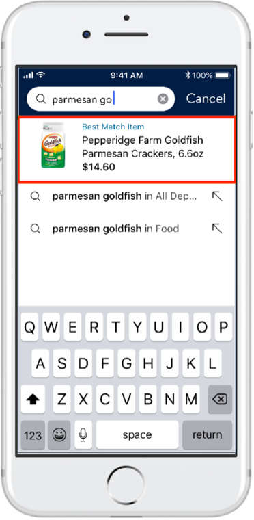
Product image visible
“Bought 2 times” and “Best match item” shown
Cons:
Not enough item details
Redesign #3
Pros:
Fulfillment option and/or price visible
Large product image
“Bought 2 times” and “Best match item” shown
Cons:
Large
may look like an advertisement
breaks the design pattern